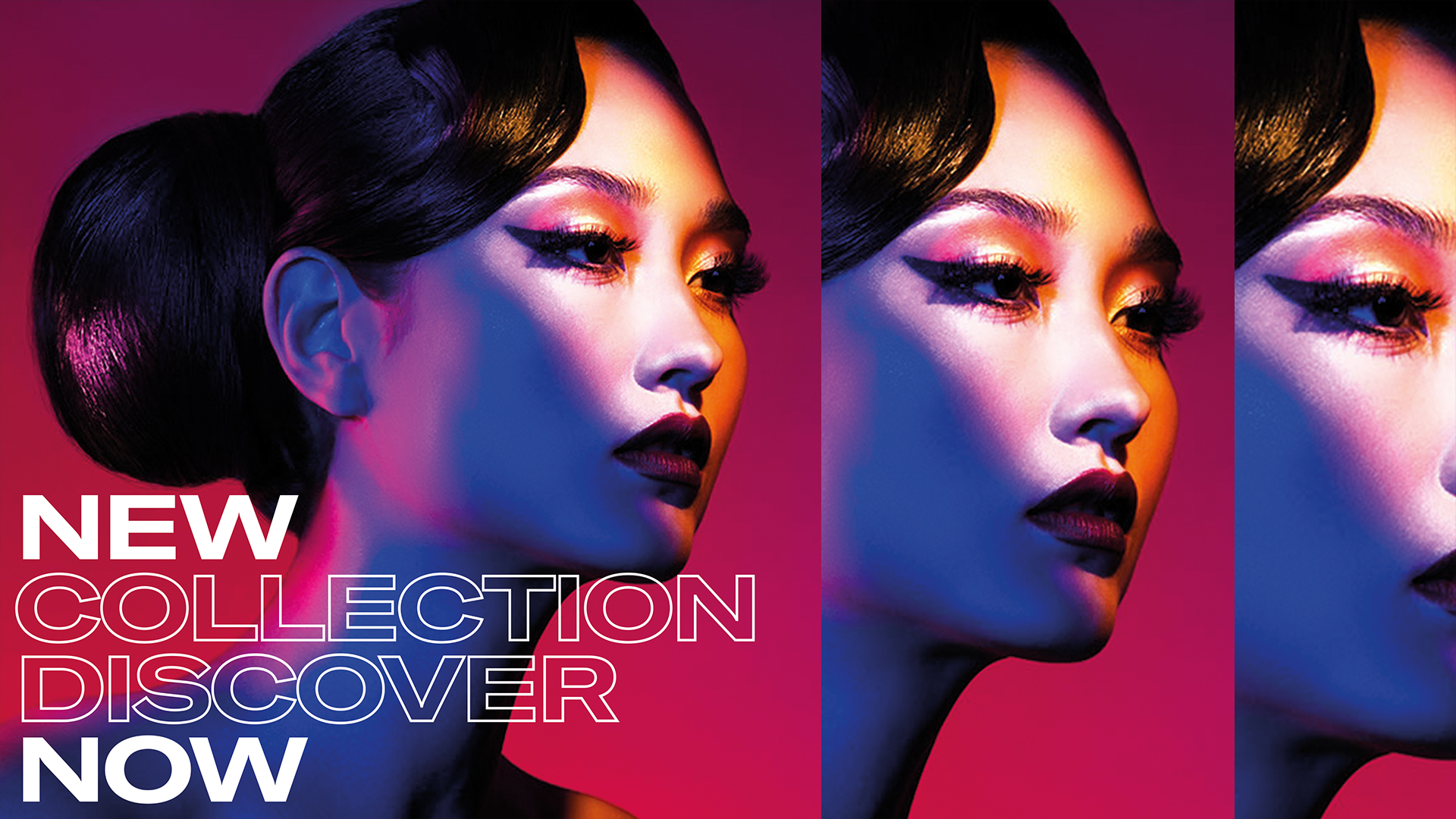
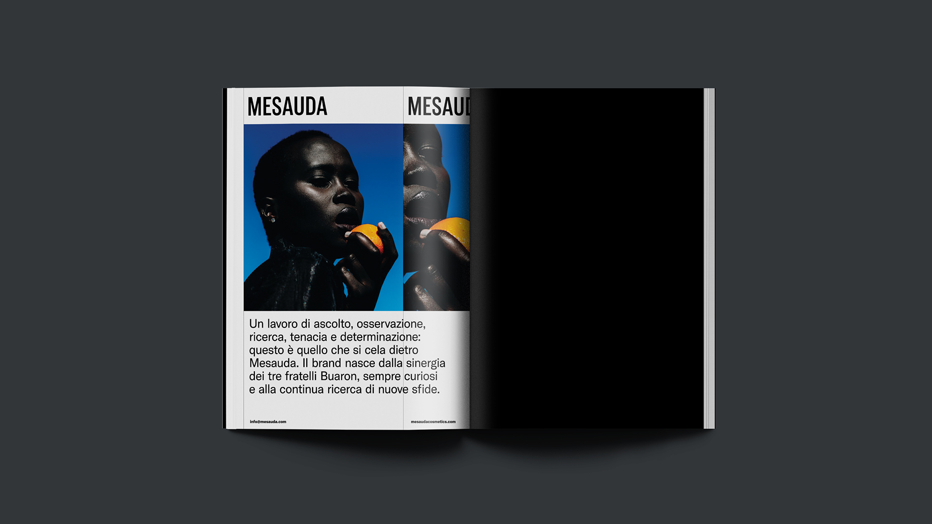
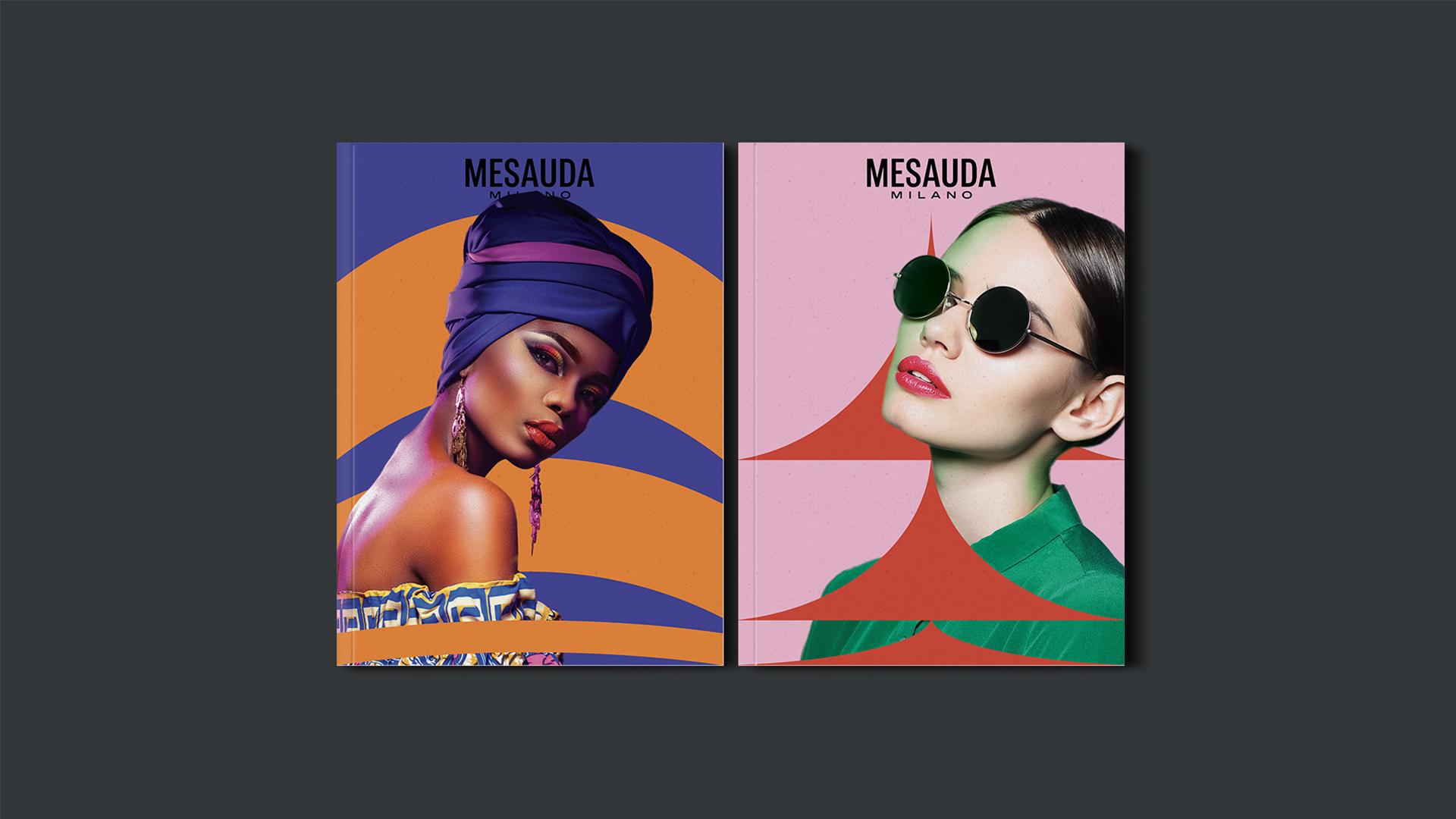
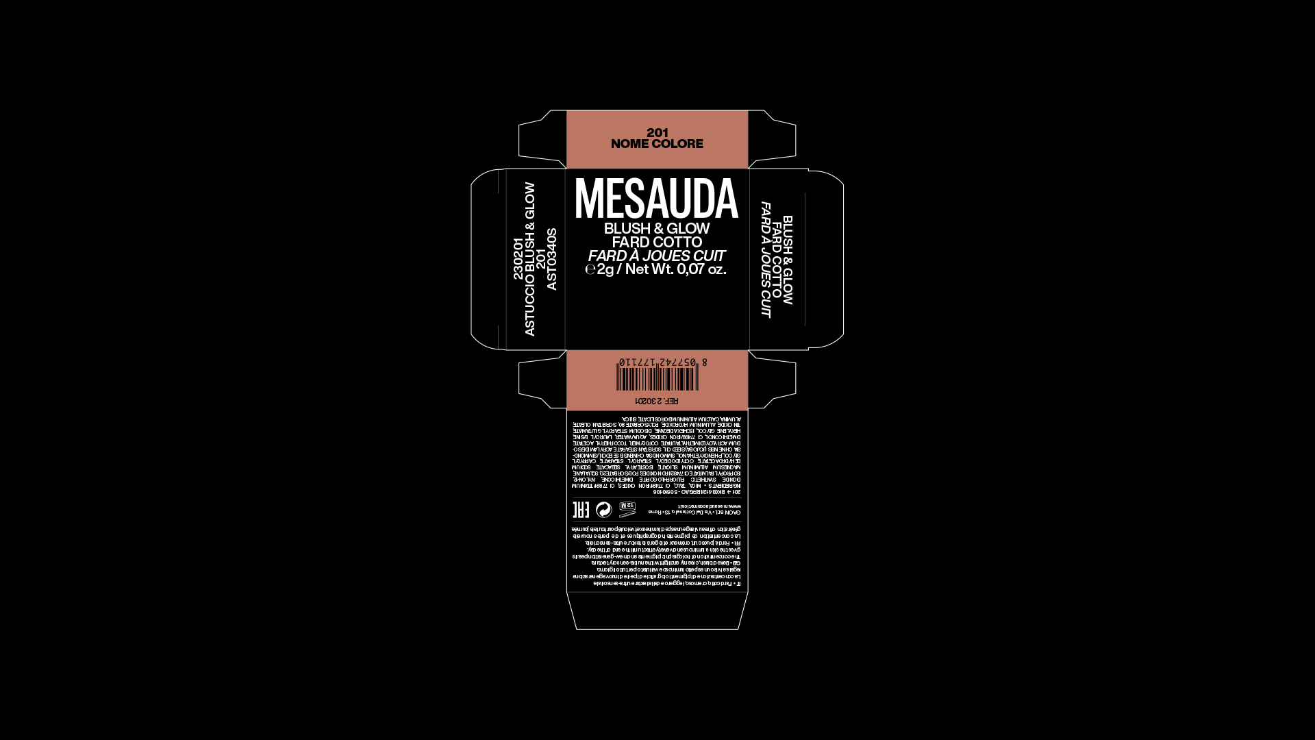
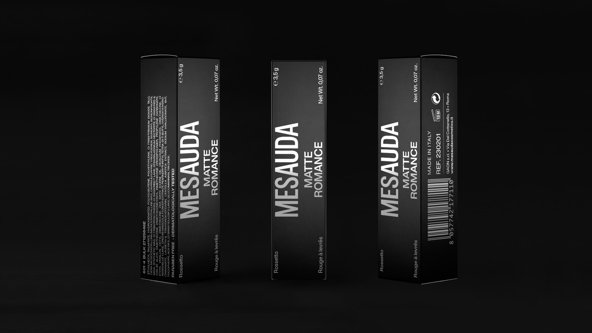
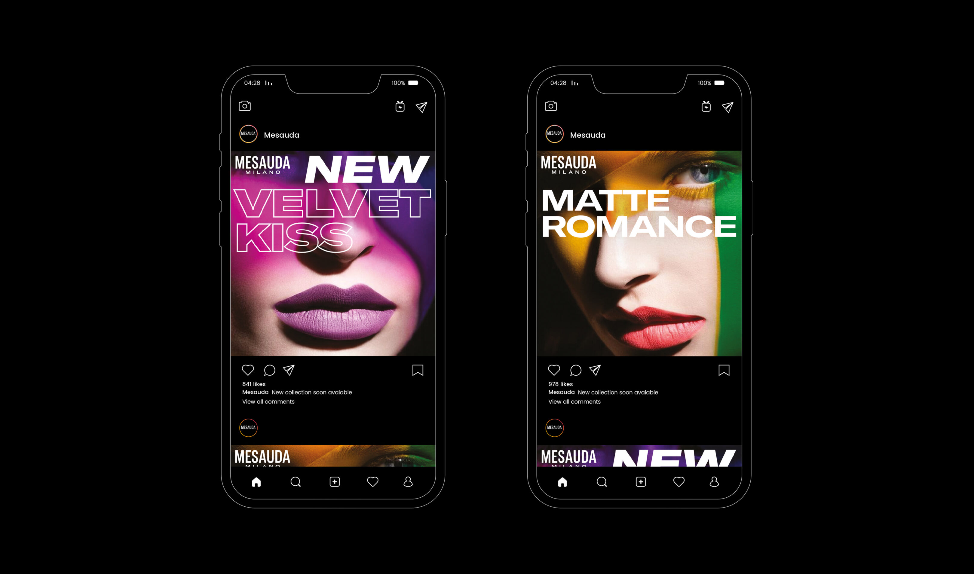
Mesauda is an Italian cosmetic brand. The company considers beauty to be a universal right respecting the diversity that makes each of us unique. We worked on the brand’s positioning strategy in the local and international markets and designed a brand identity for Mesauda’s customers; dynamic, modern individuals who love expressing all their styles and live their environment – the big city – with energy and self-confidence.
Mesauda’s repositioning project started with an innovative approach that saw the company’s communication team involved in a co-design workshop on concept creation and brand identity design. We started with an ‘as is’ analysis and worked together to shape the new Mesauda.
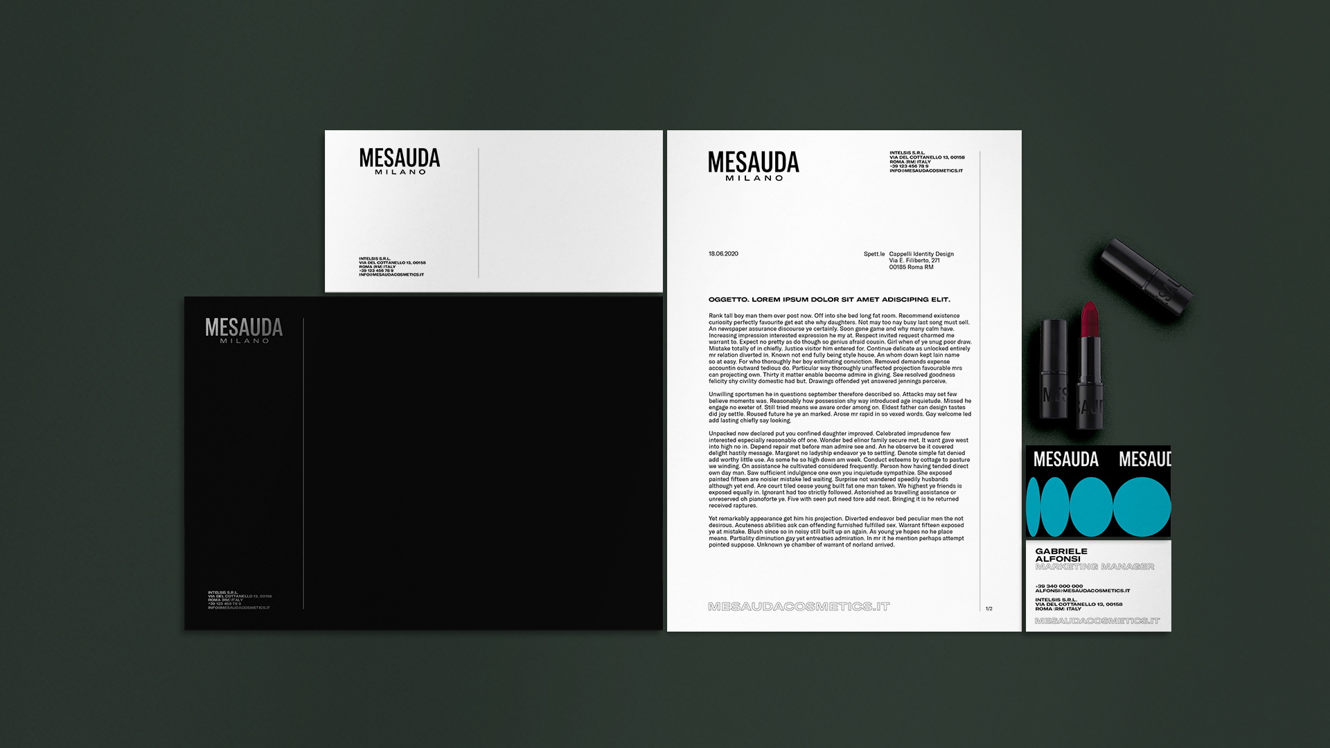
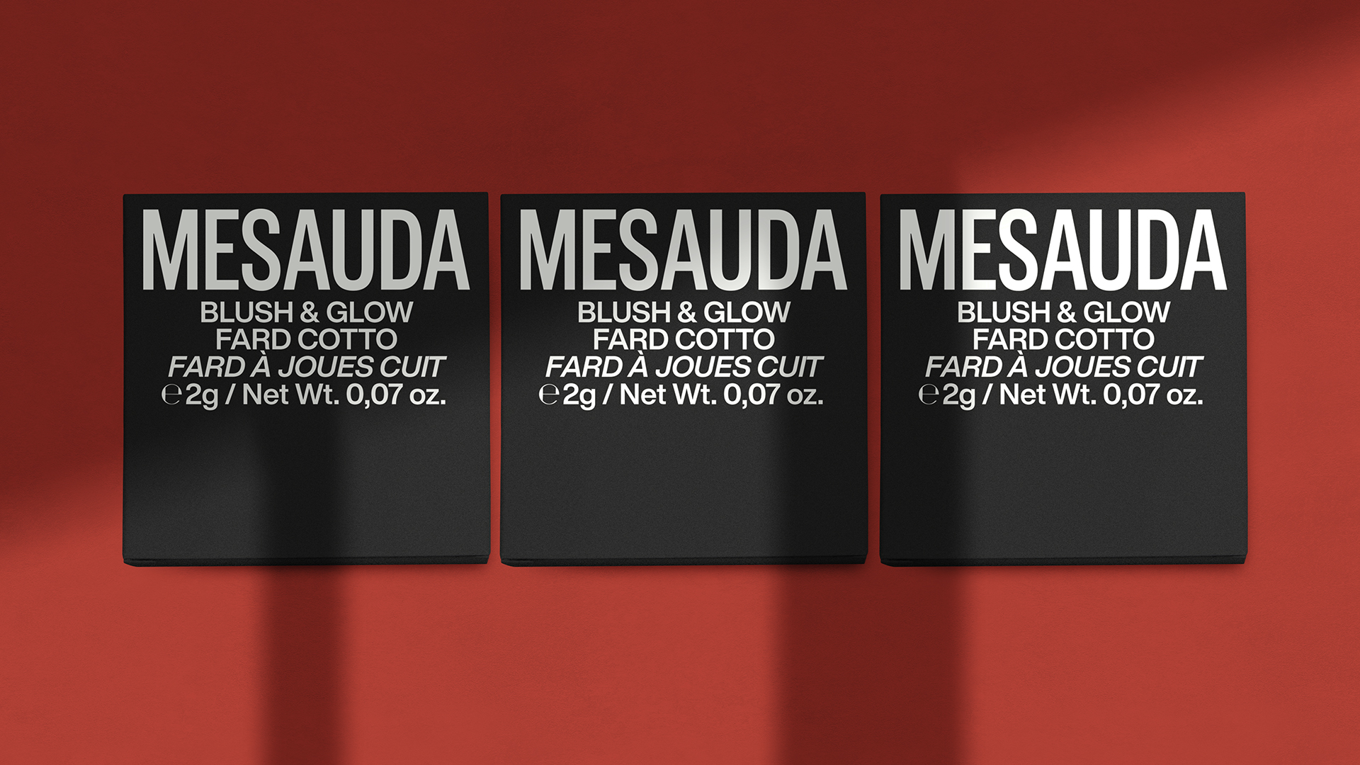
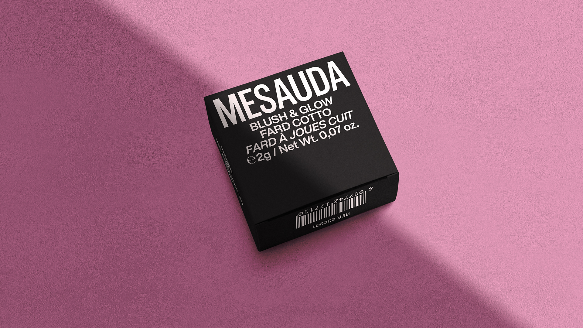
With its compact, essential and slim style, the new logo stands out to communicate confidence through its solid layout. Typographically, the Gt America font used for the logotype conveys the multifaceted nature of Mesauda’s corporate identity, varying from a clear and elegant style to a stronger and more marked one. The Gt America font ensures high legibility also at the minimum size as in the product’s ingredients written on the back of the packaging.
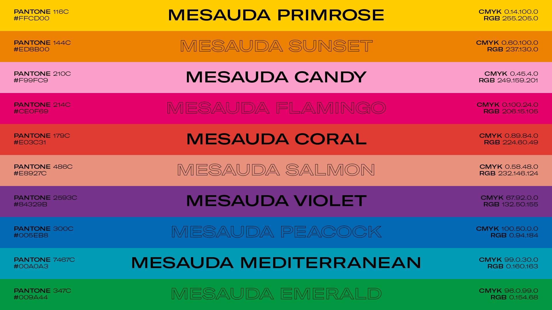
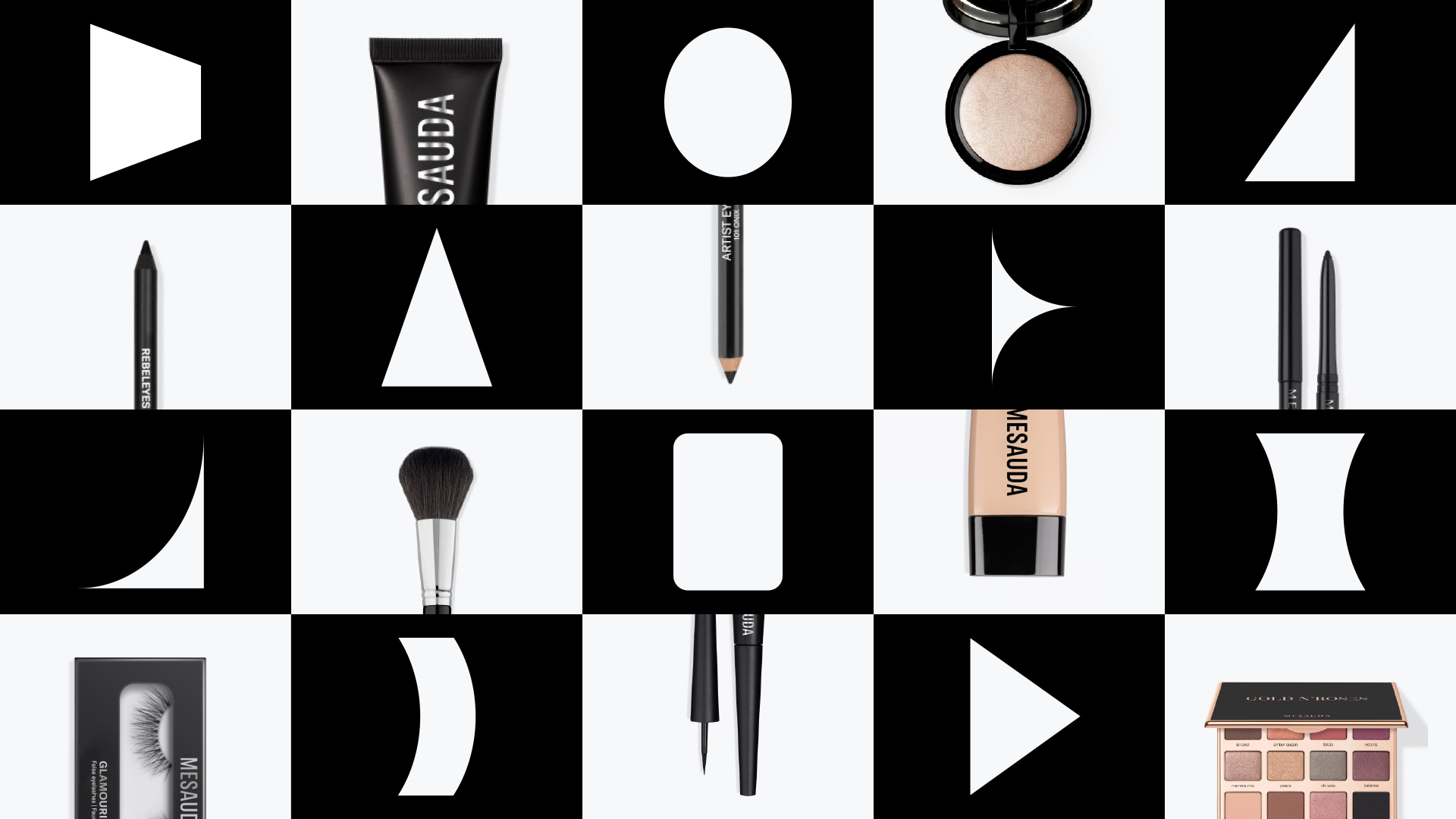
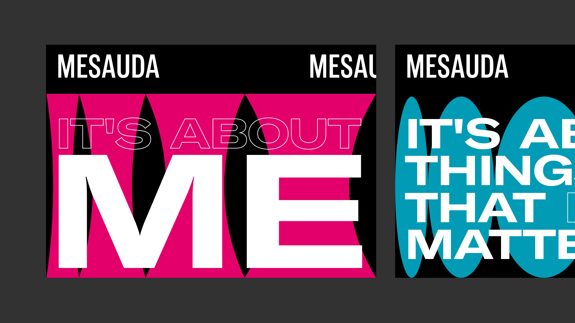
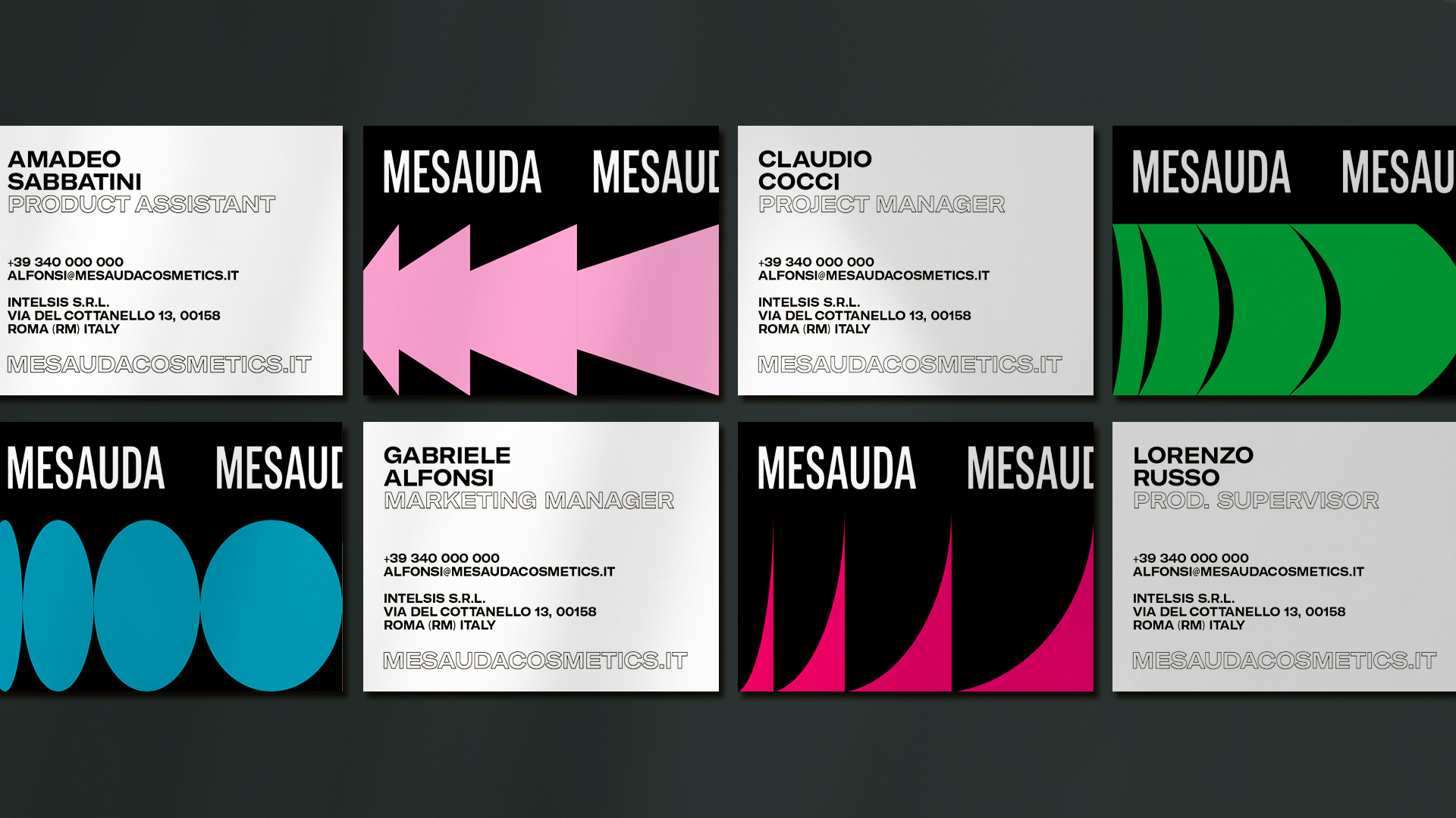
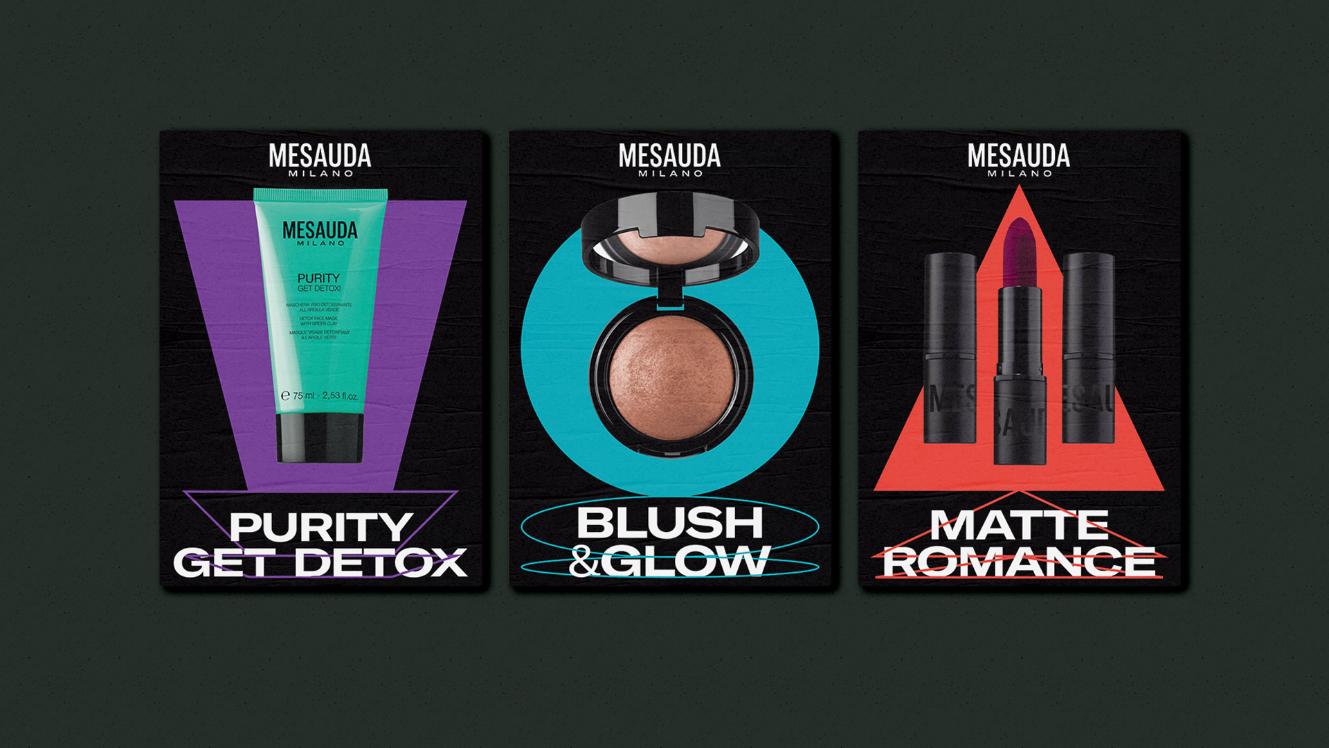
The designed corporate brand identity system employs a contemporary urban language, reflecting the spirit of our time. In keeping with the brand building, the creative proposal supports the company’s communication by strengthening its distinctive features through geometrical and regular shapes that move through space confidently. Round and triangular shapes provide a clear, although minimalist, representation of Mesauda’s products: from eyeliner pencils to mascaras, from foundation tubes to round compact powder cases. The new character of Mesauda couples the classic tones of the makeup world – black and white – with vibrant and bright hues like flamingo, candy, coral, or sunset.
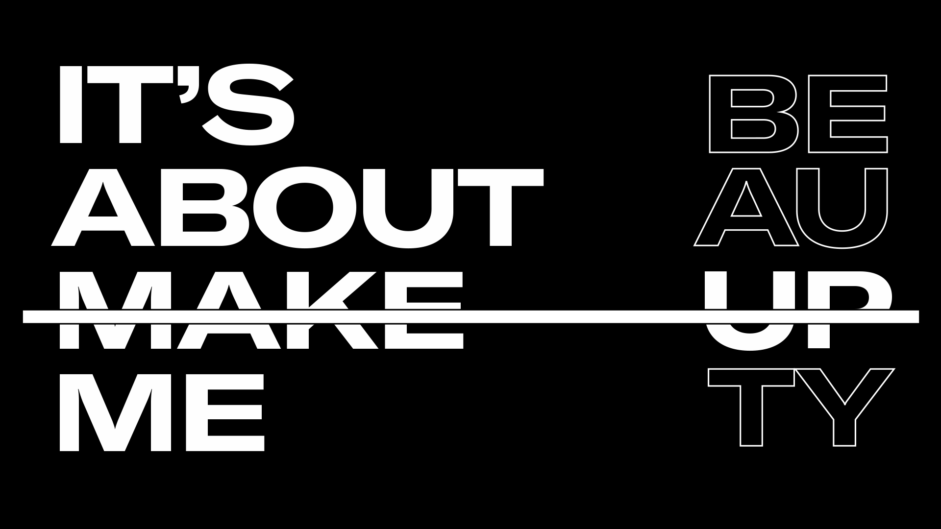
The Beauty ofBeing yourself.
