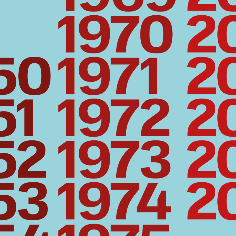
OT L22 is the name chosen for the new font inspired by the iconic typewriter Lettera22. A project designed by Cappelli Identity Design studio and promoted by Associazione Archivio Storico Olivetti.
The OT L22 font can be used on all devices to celebrate the “Olivetti Style” enshrined in Italian creativity and design history and known worldwide. In its Bold version, the font responds to the demands of our time and can be used on print and digital media. The new font will be released for free in November 2021 to celebrate the 70th anniversary of the launch of Lettera22. The Type Design project involved Emanuele Cappelli, Fabio Zanino, Antonio Pace and Lorenzo Properzi and Gaetano di Tondo, President of Associazione Archivio Storico Olivetti.
We interviewed some of them to collect further details on the project and the creative process that led to the new font. The first is Gaetano di Tondo, President of Associazione Archivio Storico Olivetti VP, Head of Communication & External Relations in Olivetti, who explains us why creating a new font was necessary.
«That is for a simple reason», Gaetano di Tondo answered. «Our Archive includes about 700 different fonts for typewriters, computers, and calculators. We didn’t want to leave this heritage unexpressed, so we thought about implementing a digital font to be used in the present day. We chose to work on a font inspired by the iconic typewriter “Lettera22” designed by Olivetti 70 years ago. We tried to create a new alphabet by recalling the style and tradition of Archivio’s historical typebars and adding a touch of the future. The OT L22 font project combines traditional and innovative aspects of our history adapted for digital communication purposes, to broaden the dialogue from real to virtual communities».
Our journey in the OT L22 world continues with Emanuele Cappelli, CEO, Creative Director & Designer at Cappelli Identity Design. We asked him to tell us more about the analysis carried out to design this new font.
«OT L22 blends historical and formal research with an analysis of the Fifties, reinterpreted with a modern tone», Emanuele explains. «It is a suitable typeface for digital communication that can be easily used on any device. From a taxonomical point of view, it could be classified as grotesque, namely, as part of those types of font that respond to the needs triggered by the industrial revolution. The OTL 22 project is undoubtedly independent. It combines technical research with historical application to produce author technical and formal interpretation.
Designing for Olivetti is a great honor for a Designer. Not only it means sharing the values of a community and a company, but also being compared to the big names who made the history of design».
Emanuele Cappelli
Listen to the full interview with Emanuele Cappelli, CEO, Creative Director & Designer at Cappelli Identity Design.
The last interview of this journey is with Antonio Pace, the Type Designer who laid down the style used to create the font and the formal requirements for its design.
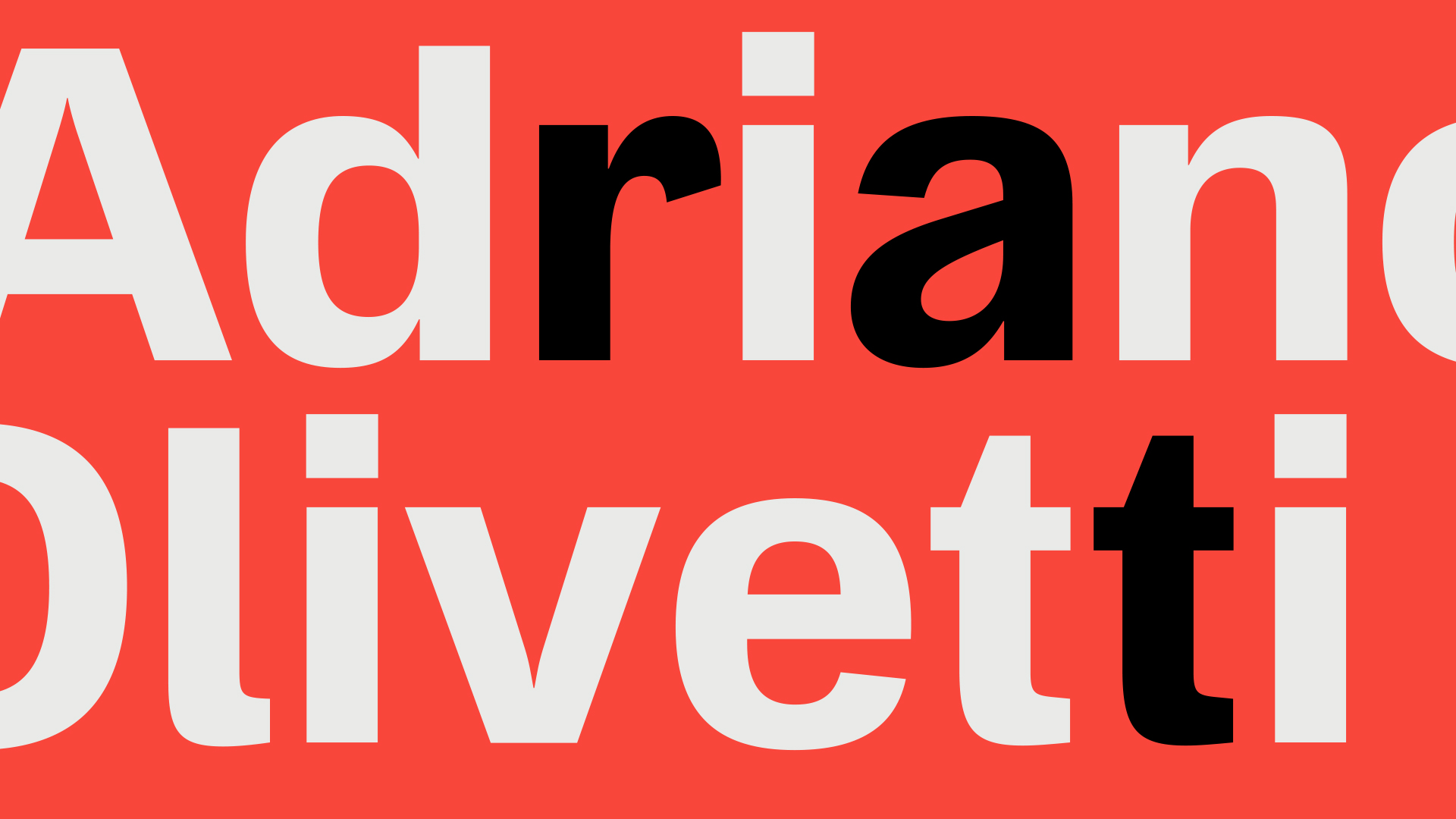
«Every project is a product of its time» Antonio tells us. «To create the OT L22 font, we started by analyzing the general linguistic and historical context that accompanied the launch of Lettera 22 (namely, the Fifties) and added the analysis of other styles and disciplines, such as architecture. The stylistic reference we used the most in this project – continues Antonio Pace – is the former Olivetti center designed by Egon Eiermann in Frankfurt am Main. With its famous inverted towers, the building provides a superb example of Italian Brutalist Architecture, in harmony with the OT L22 style. As for the typographical aspects, we passed through all of Olivetti’s historical fonts without forgetting Giovanni Pintori’s great thinking and style. The grotesque style, reflecting a rooted hope for innovation, is undoubtedly at the basis of the font design. From an institutional perspective, we aimed at strengthening Olivetti’s continuity and consistency in time. It was a heavy responsibility, as we had to find a proper interpretation of the current stylistic and technological trends».
Antonio Pace
Listen to the full interview with Antonio Pace, Type Designer.
![[E]Design Festival Treviso Talk Zanino Cappelli](https://www.cappellidesign.com/wp-content/uploads/2021/10/1-edesign-festival-treviso-zanino-cappelli.jpg)
