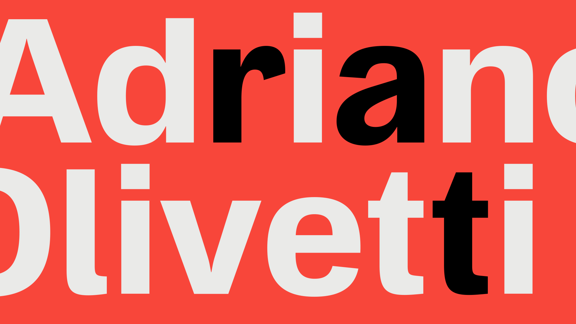
OT L22 is a Type Design project realized in 2021 to give Olivetti’s founding values a new life. The name also defines the typeface used to build the logotype and headings of the Lune Elettriche Magazine by Rinascimento Industriale. Following the launch of this collaboration with the new magazine, the first number includes an article on the reasons behind the creation of OT L22 written by Fabio Zanino – Head of Communication & External Relations.
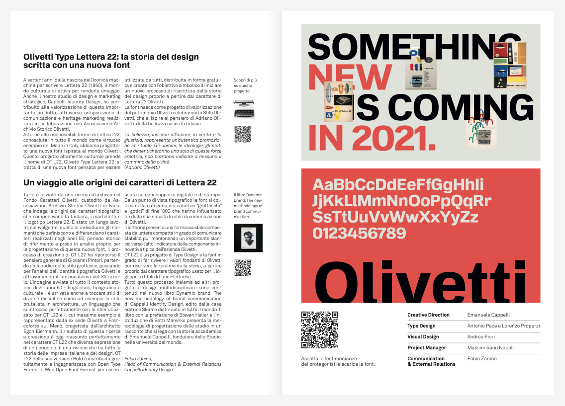
Below is an extract:
Olivetti Type Lettera 22. Seventy years after its first appearance (1950), the cultural world has decided to pay tribute to the iconic typewriter Lettera 22. Our design and strategic studio, Cappelli Identity Design, has also contributed to giving a new life to this historical product. We achieved this goal with a communication and heritage marketing operation realized in partnership with Associazione Archivio Storico Olivetti. The font was designed to celebrate the Olivetti style and heritage, born from Adriano Olivetti’s philosophy: trust originates from beauty.
A new font to write the history of design. We started by conducting research in the Olivetti Font Database (Fondo Caratteri Olivetti), stored by Associazione Archivio Storico Olivetti in Ivrea, investigating the origin of the fonts that had accompanied Olivetti’s keyboards, typewriter hammers, and the logotype of Lettera 22. The OT L22 design process recalled Giovanni Pintori’s general thought. We began by analyzing the grotesque style and moved through Olivetti’s typographical identity and twentieth-century functionalism. This investigation, conducted across the historical – linguistic, typographic, and cultural – background of the Fifties, has also included other subjects, such as the brutalist style in architecture, namely, a language that perfectly combines with the OT L22 style. The lettering, characterized by an egg-shaped and compact style, conveys a sense of stability while maintaining a slender shape: thus, underlining Olivetti’s innovative nature.
The new book Dynamic brand. The new methodology of brand communication written by Cappelli Identity Design, published by Skira, and distributed worldwide describes this process and collects other multidisciplinary design projects.
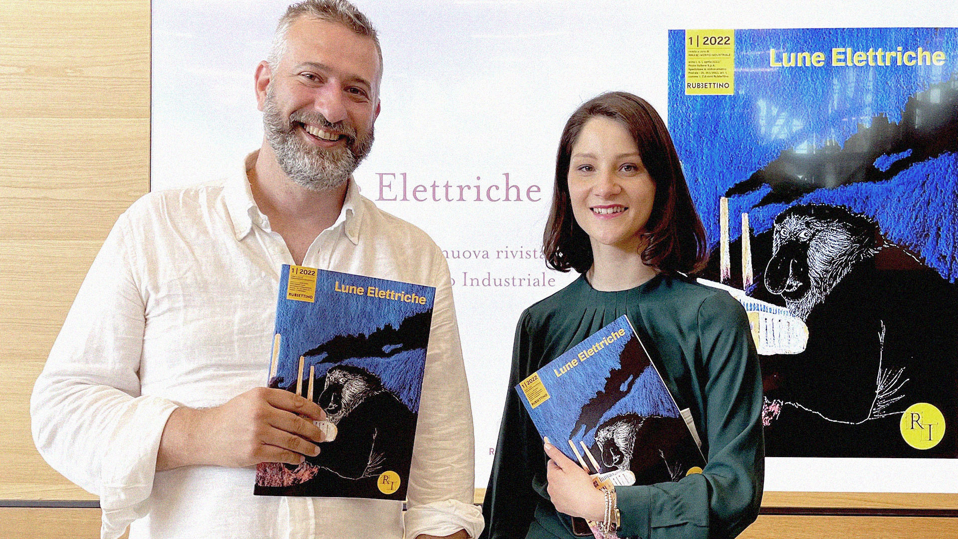
Lune Elettriche (Electric Moons)
The magazine title is inspired by Marinetti’s work and the Futurist language, and it conveys the fervor and innovative spirit of that time. The magazine, published every four months, wants to ‘unearth’ and share initiatives, ideas, good practices, and fruitful synergies revolving around the Italian industrial heritage. In a nutshell, Lune Elettriche is the first magazine devoted to enhancing the entrepreneurship culture. The first issue, dedicated to Humanism, was introduced on April 27th, 2022, in La Marzocco, Pian di San Bartolo’s (Fiesole) coffee machine manufacturing factory.
The CEO Guido Bernardinelli and the Chief Product Designer Stefano Della Pietra hosted the event and shared their experience with the audience. The managers of Olivetti and Alessi S.p.A. also joined the presentation via conference call. The first issue also features interviews to Francesco Vena (Amaro Lucano), Cinzia Turli (Lazzaroni), Studio Negri-Clementi, Cappelli Identity Design, Mauro Belloni, Claudio Burlando.
Lune Elettriche is published by Rubettino and edited by Valentina Barbieri and Luca Borghini, founders of Rinascimento Industriale, a network specialized in promoting businesses and trademarks.
![[E]Design Festival Treviso Talk Zanino Cappelli](https://www.cappellidesign.com/wp-content/uploads/2021/10/1-edesign-festival-treviso-zanino-cappelli.jpg)
