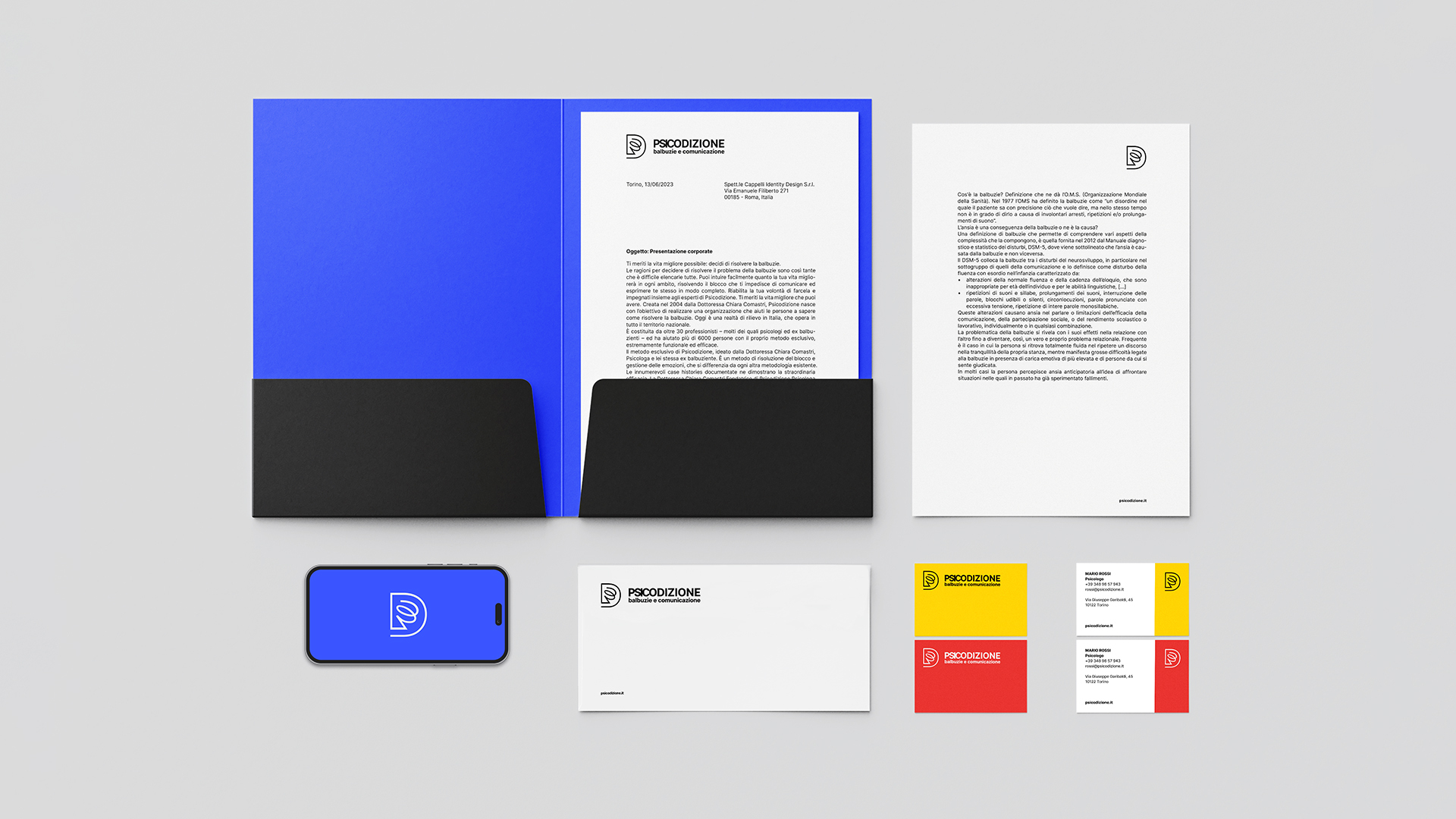
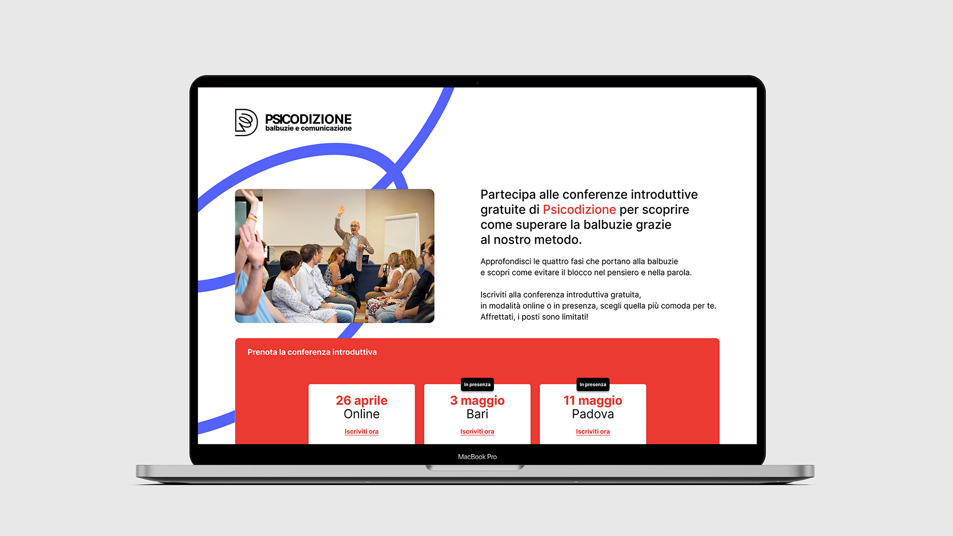
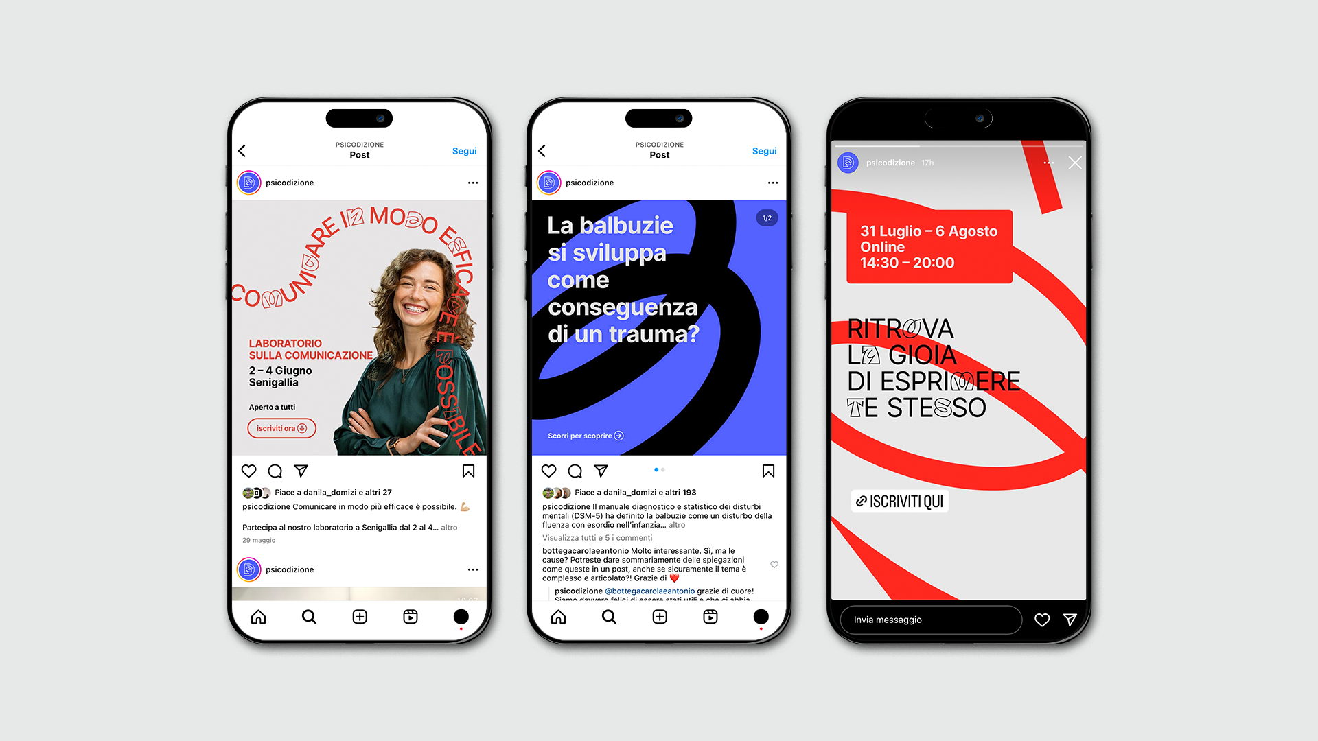
A new brand identity for Psicodizione, a social cooperative dedicated to overcoming stuttering. The challenge is to create a fluid, powerful and clear visual identity, enhanced by an effective digital strategy.
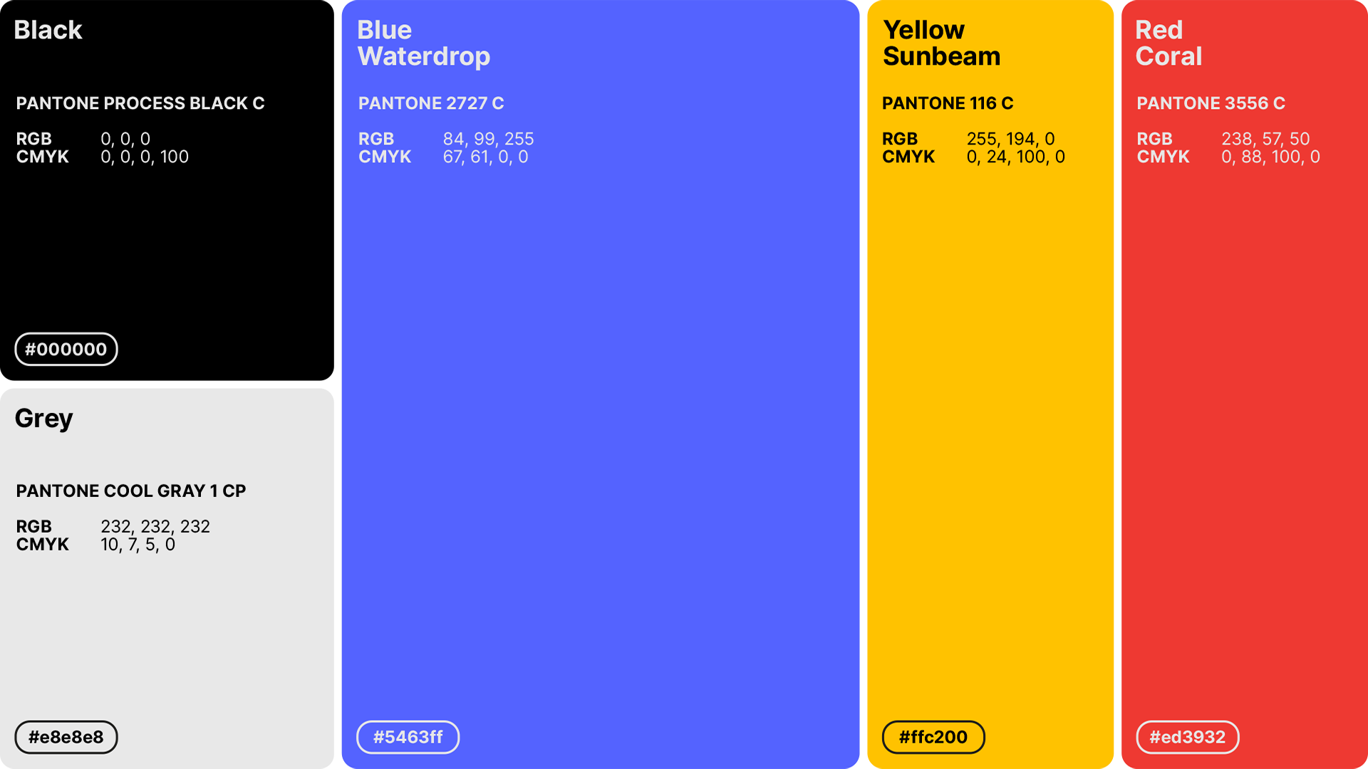
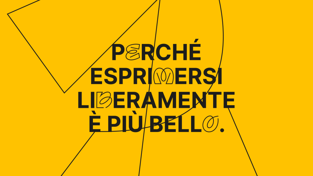
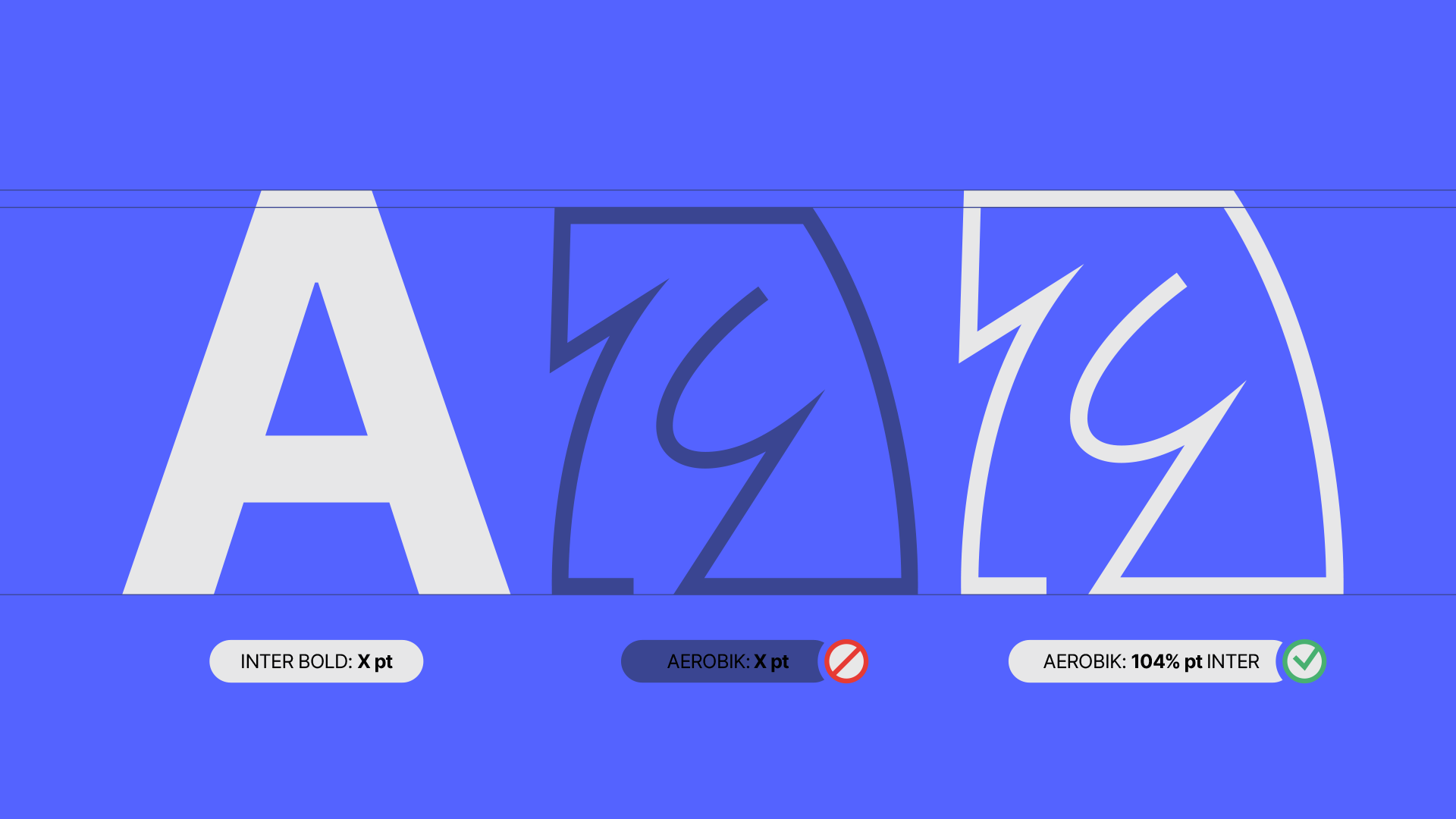
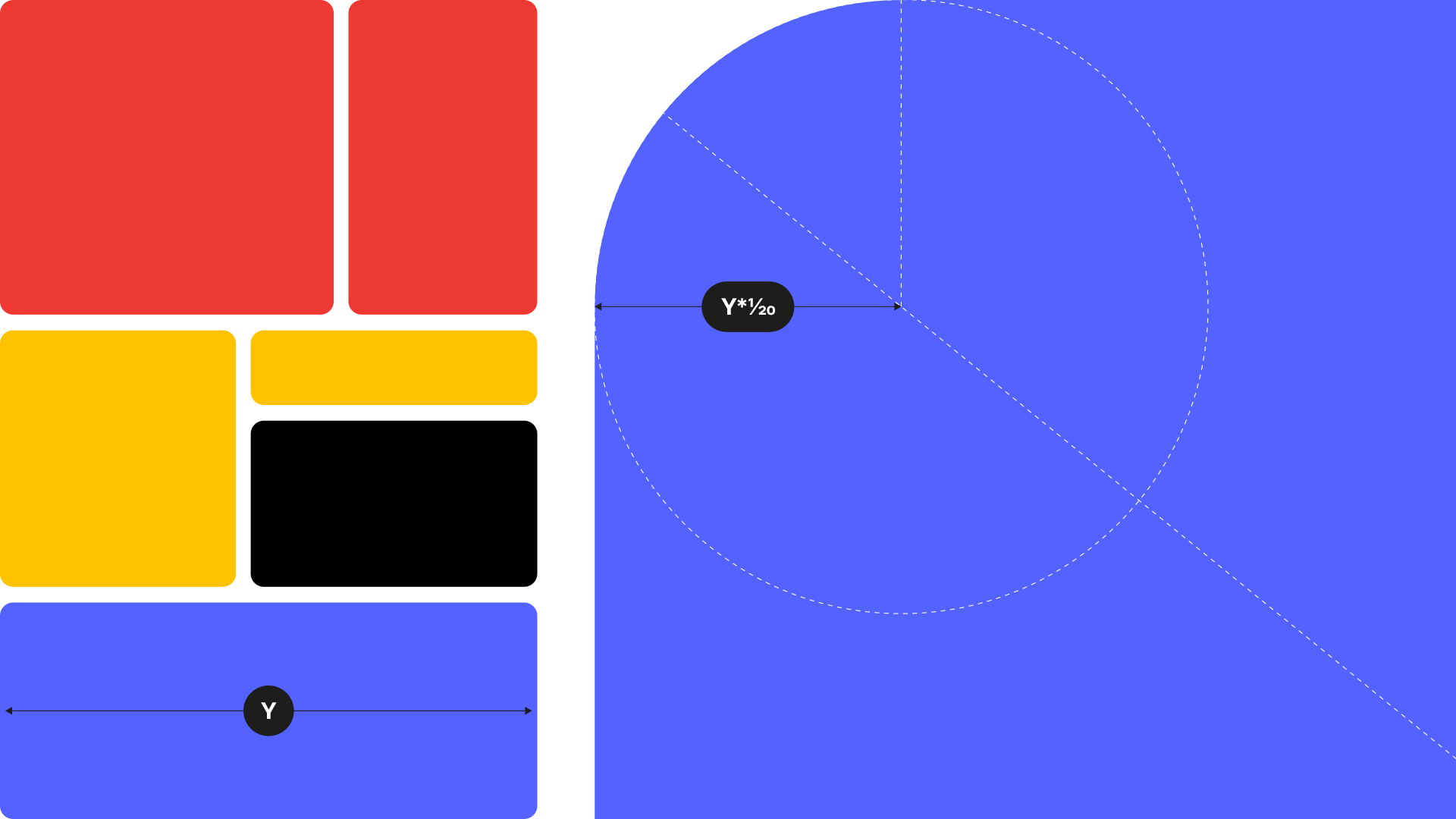
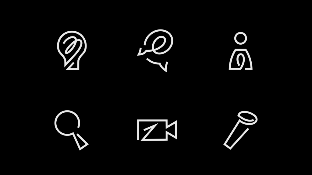
The heart of this transformation lies in the design of the visual system using the Dynamic brand methodology. The Psicodizione logo consists of the linear letter ‘D’ containing the ‘P,’ representing the process of liberation from stuttering. This concept is also reflected in the logotype, with the initial letters close together. The colour palette, with bold and vibrant tones, conveys the expressive potential of people overcoming stuttering.
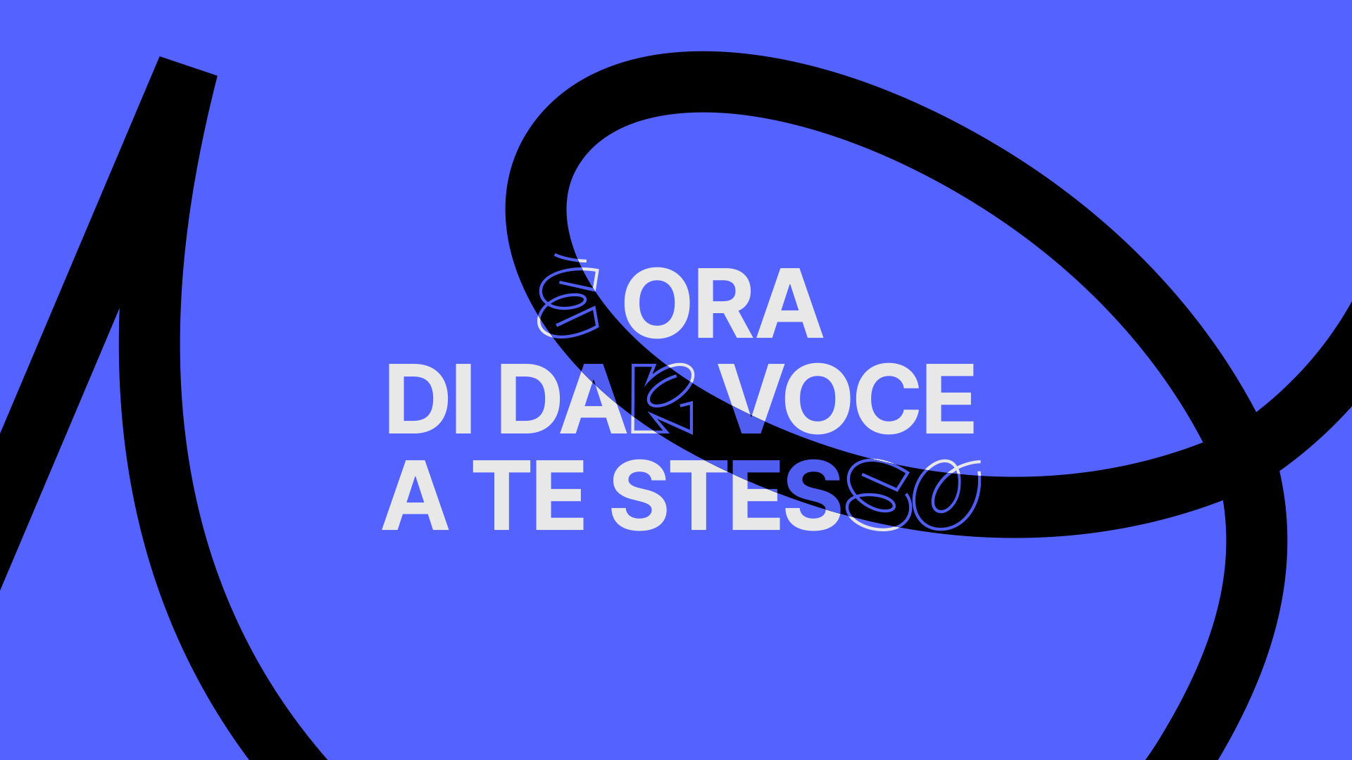
With a solid digital presence and a unique visual identity, Psicodizione is ready to continue its mission: to help people free their voice.
Change is growth.
We made it style.

 Previous